Brian Du
Case study 01 2025 — 2026
Global Health Solutions

Amplify

A product initiative developed inside Global Health Solutions. The work ran from a refresh of the parent brand and its marketing website through the product's own identity, its member and employer interfaces, and into early React Native implementation.
Role
Brand, product design & front-end
Organization
Global Health Solutions
Platform
React Native, responsive web
Scope
Brand, product system, initial build
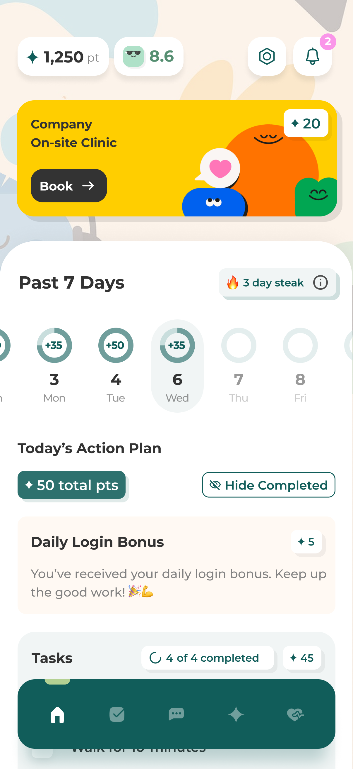
Amplify employee app — points, weekly streak and today's action plan
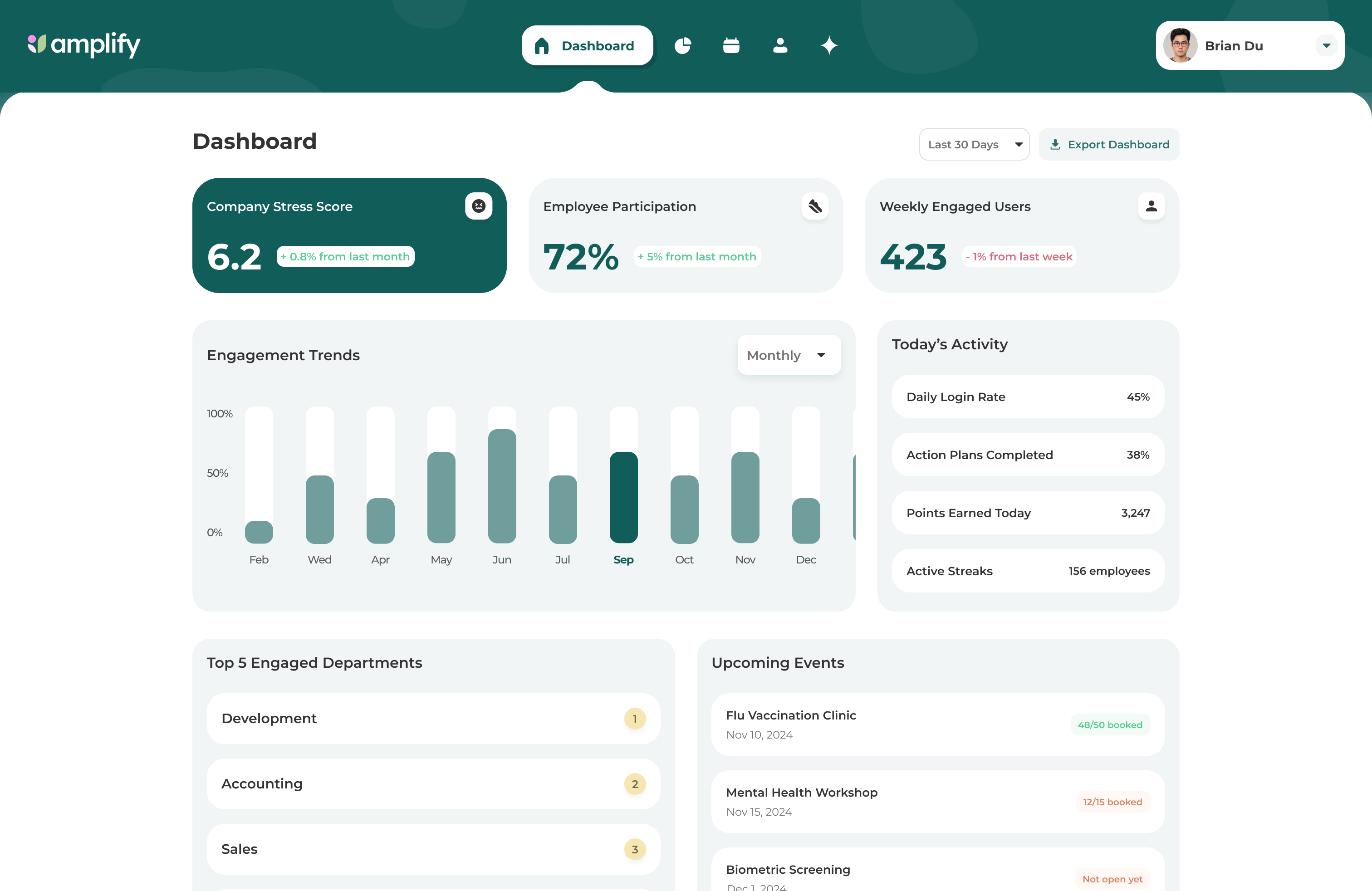
Amplify employer dashboard — stress score, participation and engagement trends
Two audiences, one system: the employee app carries the daily experience, the employer console carries participation and program data.
The problem

A service business with no product to stand on

Global Health Solutions delivered biometric screening and onsite wellness services to employers. The results landed as reports, and the relationship with the employee ended there — nothing carried the insight forward into behaviour, and nothing gave the employer a picture of what their program was doing.

The original concept was a basic wellness offering. Our work was to evolve it into a personalized, intelligent employee health experience: something worth opening more than once a year, with benefits, services and rewards attached to it.

Employee surface
Mobile, personal
Employer surface
Web, aggregate
Existing inputs
Biometric screening, onsite services
Starting point
Concept only, no product
The parent brand

The work started at the company, not the product

Before the product experience expanded, I helped evolve how Global Health Solutions presented itself — refreshing the brand and rebuilding the marketing website so the company had a clearer, more cohesive foundation for the work it was already doing.

That foundation mattered later: when Amplify needed its own identity, it had something credible to sit next to rather than start from.
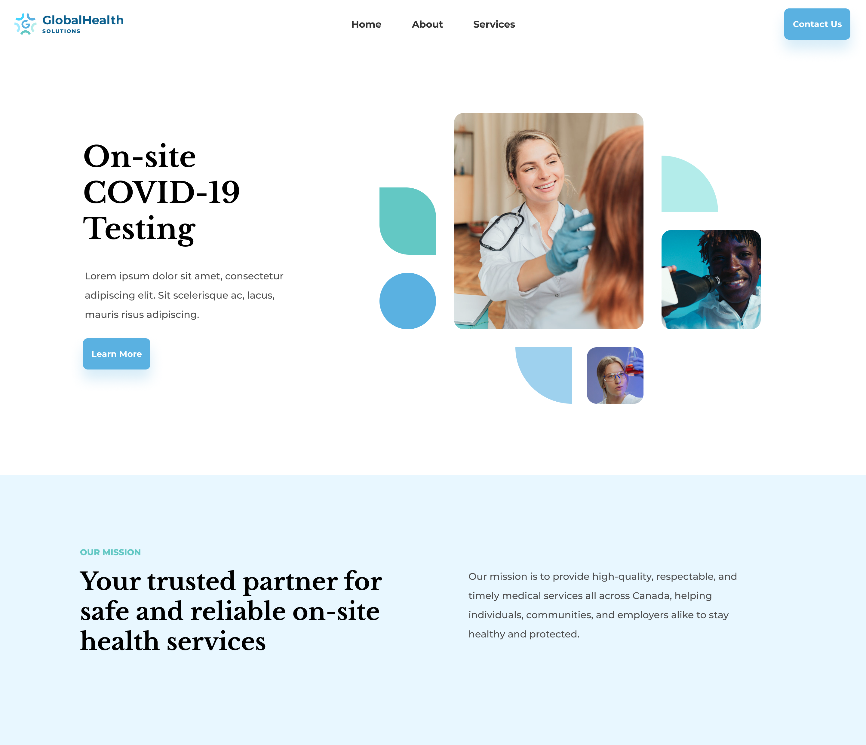

Global Health Solutions marketing website, desktop
The rebuilt marketing website.
Global Health Solutions marketing website at phone width
The same site at phone width.
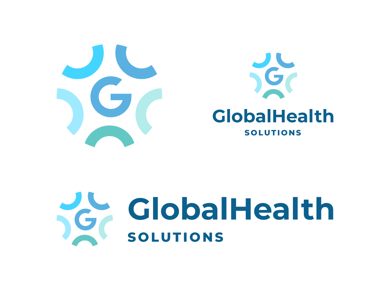
Global Health Solutions mark and horizontal and stacked lockups
Mark and lockups
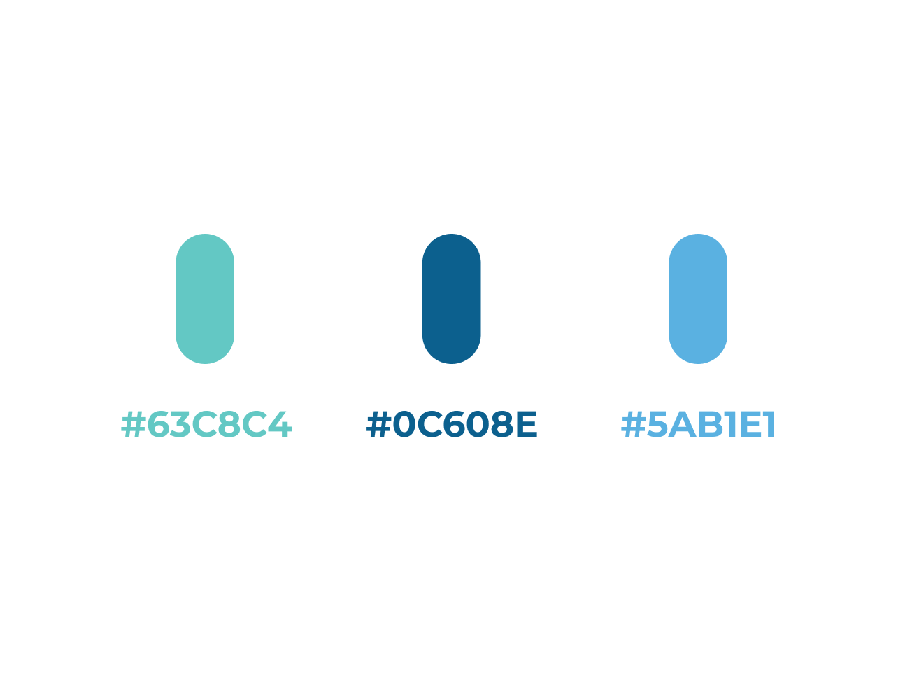
Global Health Solutions palette: 63C8C4, 0C608E and 5AB1E1
The palette
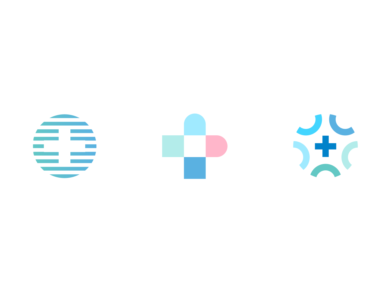
Three mark directions explored for Global Health Solutions
Directions explored along the way
How the two connect

Amplify emerged inside Global Health Solutions

Global Health Solutions logo
Global Health Solutions
Parent company — brand and marketing foundation
logo-amplify-2
Amplify
Product initiative — brand and digital product experience

The concept began as a fairly conventional employee wellness offering. As it evolved toward a personalized, AI-assisted health and benefits experience, it outgrew what the parent brand alone could carry.

Amplify needed to read as its own product without cutting itself off from the credibility of the company behind it. That constraint shaped both the identity and the interface work that followed.

Product identity

Its own voice, borrowed credibility

I established the product's visual identity and applied it across presentation material and the digital experience.
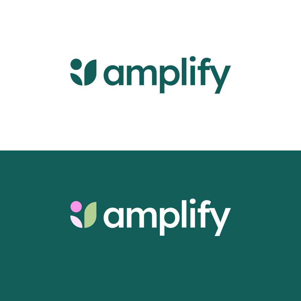
Amplify logo in dark green on white and reversed on green
Logo
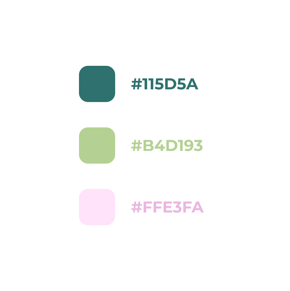
Amplify palette: 115D5A, B4D193 and FFE3FA
Colour
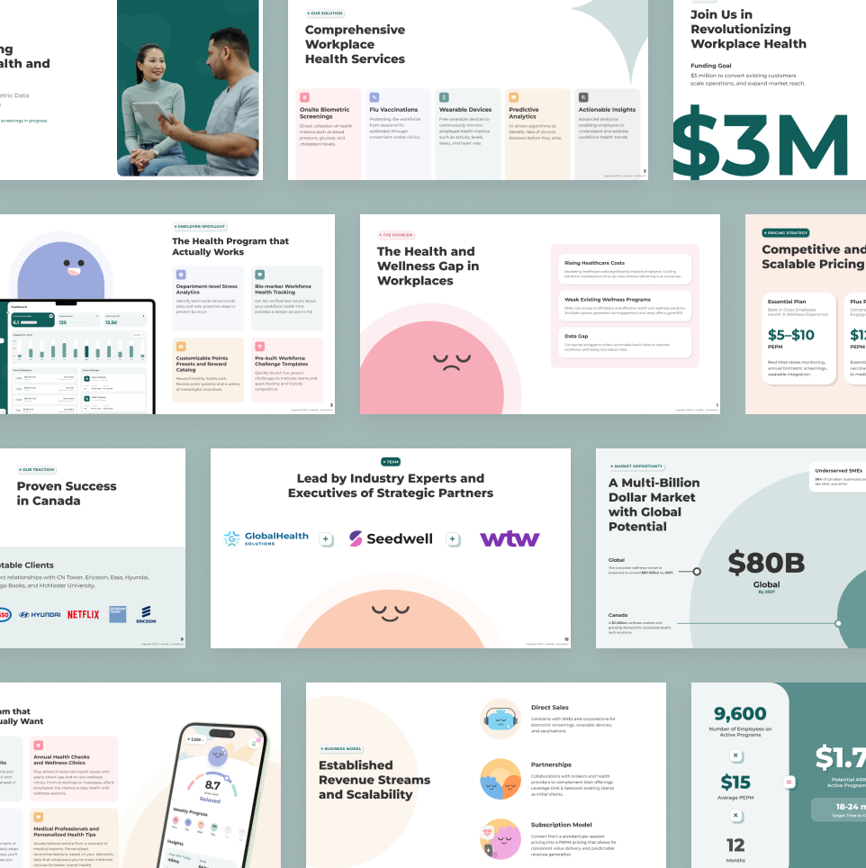
Amplify investor and program presentation pages
Presentation material
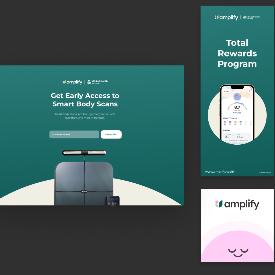
Amplify marketing graphics: waitlist page, rewards program poster and brand card
Marketing graphics
Approach

Vision, brand and system — then enough code to make it real

01
Product vision
Co-developed the direction with the client: what the platform is for, which behaviours it should reward, and where personalization earns its place.
02
Brand
Logo, colour system, typography and visual assets, extended into presentation decks, sales materials and marketing collateral.
03
System & screens
Information architecture, user journeys and interface patterns into a design system, then dozens of employee and employer screens in high fidelity.
04
Initial build
Established the React Native front end independently using Cursor: navigation, reusable interface foundations, placeholder data and early functional screens.
The employee app

Insight, then a next step

Screening results become a plan; the plan earns points; points buy back into the benefits the employer already pays for.
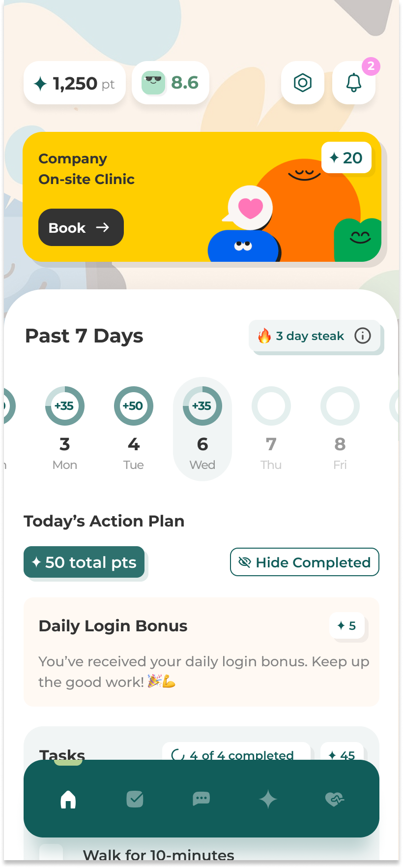
Amplify today's plan screen
Today's plan — the daily surface, built from the last screening.
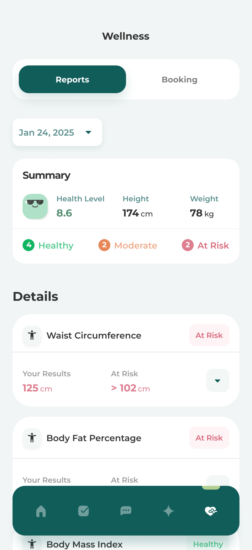
Amplify biometric insights screen
Biometric insights — results in plain language, with movement over time.
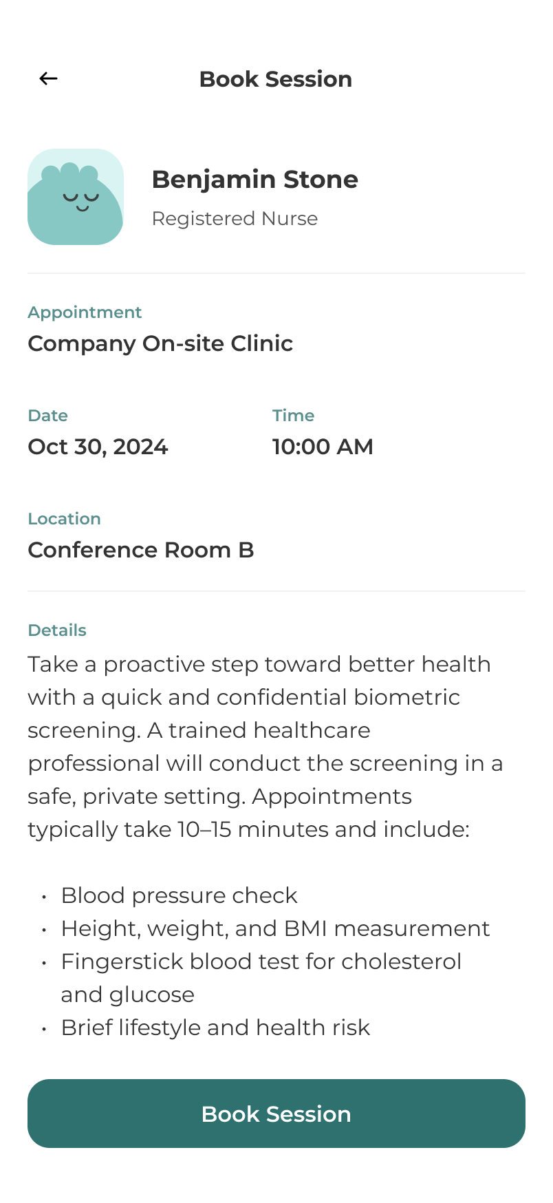
Amplify onsite booking screen
Onsite booking — services the employer runs, bookable in two taps.
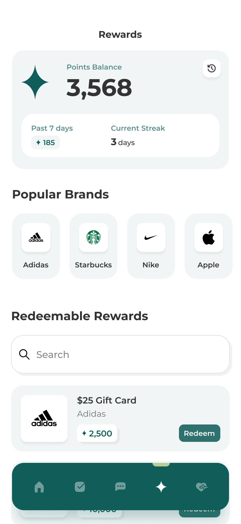
Amplify points and rewards screen
Points & rewards — the incentive loop that keeps the app open.
The employer console

Participation, aggregated

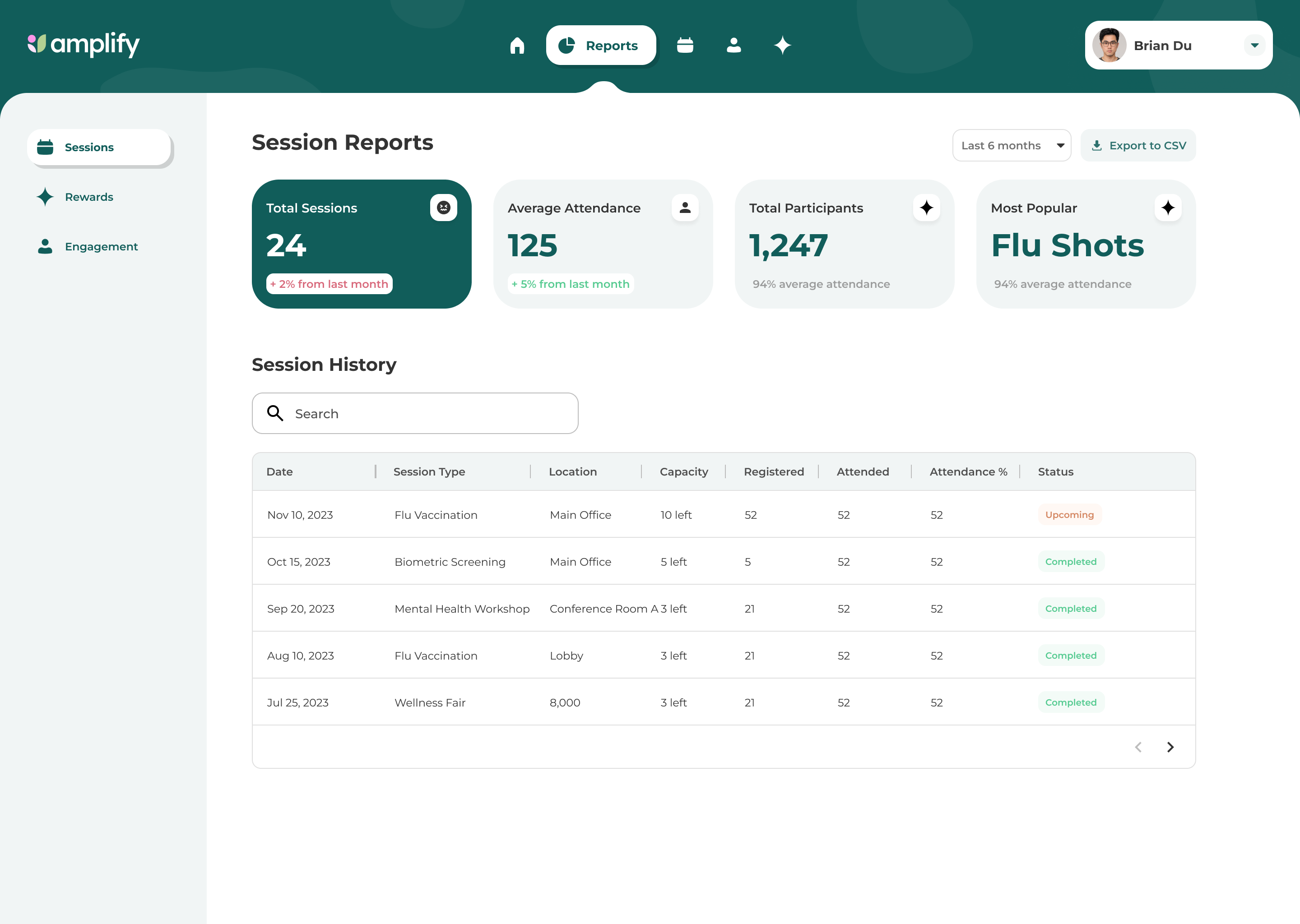
Amplify session reports — attendance and participation
Workforce analytics — participation and program health, never individual results.
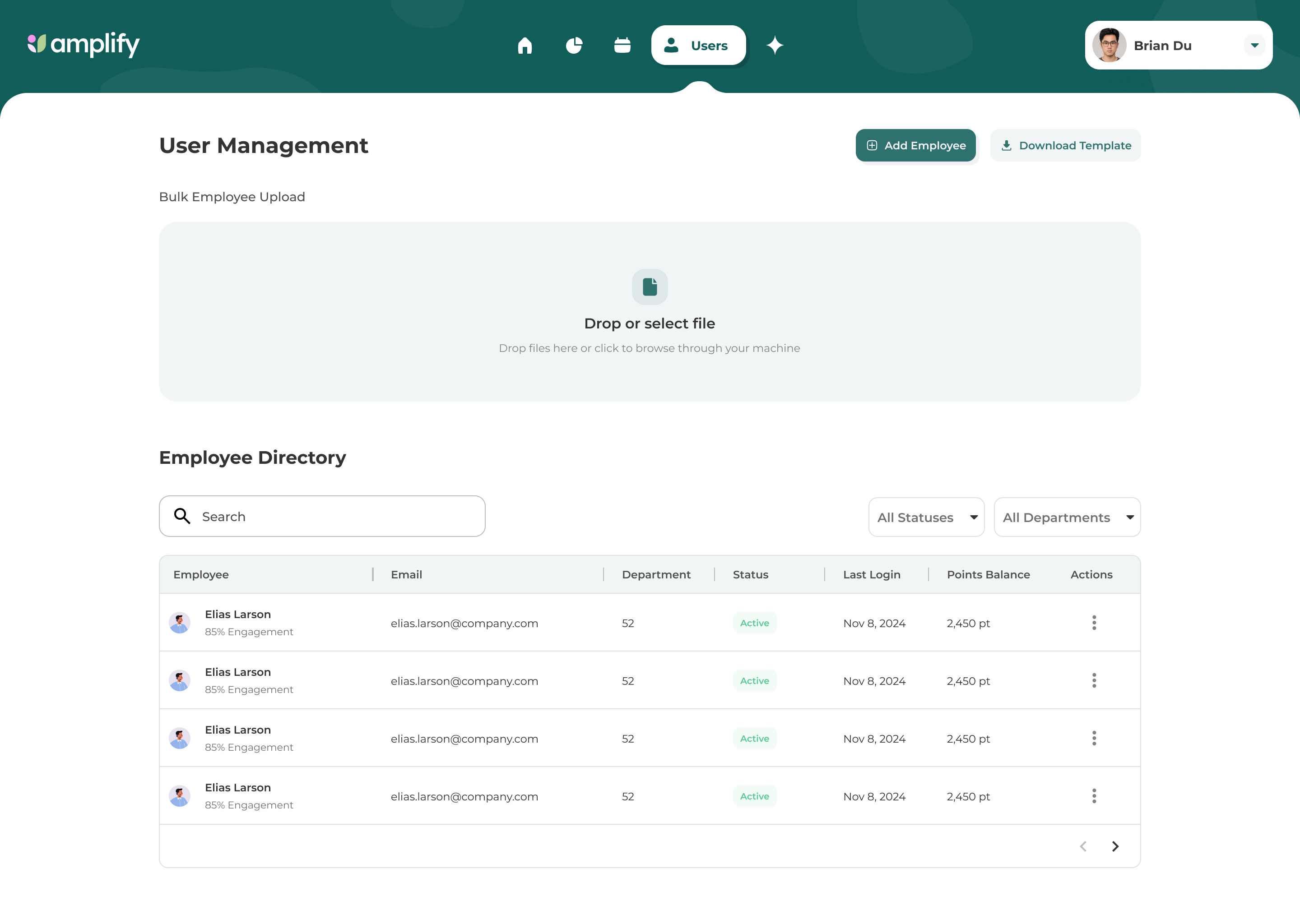
Amplify user management — employee directory and bulk upload
Program administration — onsite scheduling, rewards budget and communications.
Design system

One vocabulary across two products

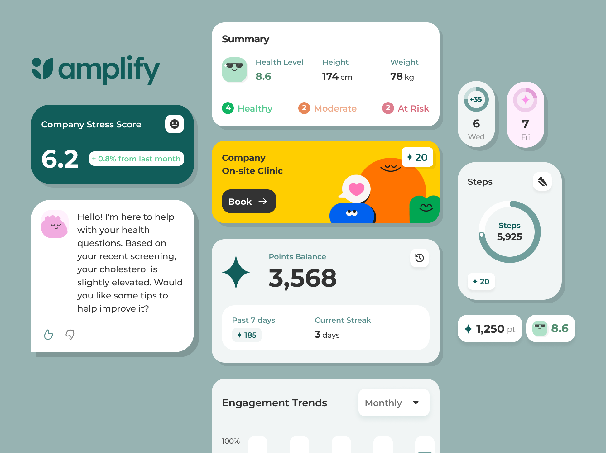
The employee app and the employer console share one type scale, one spacing rhythm and one component library, so a change to a card or a form field lands in both. The system was documented alongside the screens rather than after them.
Foundations
Type scale, spacing, colour roles, elevation, iconography
Components
Cards, metrics, forms, sheets, navigation, empty and loading states
Patterns
Insight-to-action, booking, points earn and redeem
Brand
Logo, colour system, typography, decks and sales collateral
Amplify component library — logo, metric cards, coach message, points balance and progress rings
The component library as it stood at handoff to development.
Into implementation

Designed against the build, not beside it

My involvement did not stop at static design. I began translating the product into React Native, which meant the design decisions were made with implementation constraints already in view rather than discovered afterward.

Navigation, the reusable foundations and a set of early screens ran on placeholder data. Working in both places kept the visual system close to the thing actually being built, and kept the handoff short.

Where it landed

Delivered: a brand, a product system and a running front end

The initiative was paused before backend development, when funding for the next phase did not materialize. What exists is the parent brand refresh and marketing site, the Amplify identity, the product direction, the design system and high-fidelity screens across both audiences, plus a React Native front end running on placeholder data. The AI capabilities are product direction, not shipped functionality.

Brand
Delivered
Design system
Delivered
Front end
Initial build
Backend
Not built
Next case study
Seedwell
Fintech · 2019 — 2024

Want the full walkthrough, including the parts that aren't public?

Email me All work
© 2026 Brian Du. All rights reserved.
Design Engineer